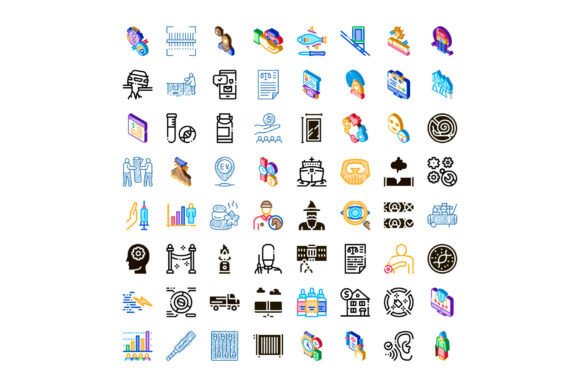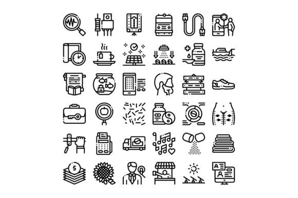
Diverse Linear Icons Collection: A Modern Toolkit for Digital Clarity and Visual Communication
Icons are the silent language of digital interfaces—small, scalable, and instantly recognizable. Among today’s most versatile visual assets are linear icons: minimalist, stroke-based symbols defined by clean lines, consistent weight, and thoughtful negative space. A Diverse Linear Icons Collection goes beyond generic clipart—it’s a thoughtfully curated set spanning healthcare, lifestyle, nature, business, and technology. Designed for clarity and cohesion, these icons serve as foundational elements in modern web design, mobile apps, dashboards, infographics, and educational materials.
What Makes Linear Icons Different—and Why They Matter
Unlike filled or gradient-heavy icons, linear icons rely on outline strokes—typically uniform in thickness (e.g., 1.5–2 px)—to convey meaning. This stylistic choice isn’t just aesthetic; it supports scalability, accessibility, and adaptability across devices and color schemes. Because they lack solid fills, linear icons integrate seamlessly into light and dark modes, remain legible at small sizes (like 16×16px favicon variants), and pair naturally with typography in UI layouts.
Crucially, “diverse” in this context means more than visual variety. It reflects intentional representation: inclusive depictions of people across ages, abilities, and ethnicities; gender-neutral healthcare symbols; eco-conscious nature motifs (like pollinators, native plants, and renewable energy); and business icons that reflect remote collaboration, ethical finance, and agile workflows—not just outdated tropes like briefcases and fax machines.
Healthcare: Communicating Trust and Clarity
In telehealth platforms, patient portals, and public health campaigns, clarity is non-negotiable. A linear stethoscope icon signals clinical care; a heartbeat line graph conveys real-time vitals; a wheelchair-accessible restroom symbol affirms inclusivity. Unlike stylized or cartoonish alternatives, linear healthcare icons avoid unintended emotional cues (e.g., overly cheerful faces beside serious diagnoses) while maintaining warmth through proportion and rhythm. They’re also WCAG-compliant when paired with sufficient contrast and descriptive alt text—making them essential for accessible health tech.
Lifestyle & Wellness: Supporting Everyday Decisions
From habit-tracking apps to nutrition guides, lifestyle icons help users navigate personal growth without cognitive overload. Consider a linear icon showing two hands holding a sprouting seedling—representing mindfulness and growth—versus a generic “leaf” icon. Or a subtle clock-and-yoga-pose hybrid indicating “mindful time management.” These aren’t decorative flourishes; they’re visual anchors that reduce reading time, support multilingual audiences, and reinforce behavioral goals through consistent, positive imagery.
Nature & Sustainability: Visualizing Systems, Not Just Scenes
A strong linear nature set avoids clichés (think: lone tree on a white background) in favor of systems-aware symbols—like interconnected water droplets for circular economy, layered soil strata for regenerative agriculture, or a wind turbine integrated into a mountain silhouette. These icons empower educators, NGOs, and ESG reporting tools to illustrate complex ecological relationships simply and accurately. When used in infographics about carbon footprint reduction or biodiversity loss, they transform abstract data into relatable, human-scale visuals.
Business & Productivity: Reflecting Modern Work Realities
Gone are the days when “business” meant boardrooms and paper stacks. Today’s linear business icons include collaborative whiteboards, encrypted lock + cloud symbols for data security, AI-brain hybrids for automation, and even icons representing flexible workspaces—like a laptop beside a bicycle or a shared workspace with diverse avatars. These symbols support internal training decks, SaaS onboarding flows, and investor presentations—communicating innovation, ethics, and adaptability without jargon.
Technology & Digital Infrastructure: Demystifying the Complex
Linear tech icons excel where abstraction meets utility. A simplified server rack with visible network lines clarifies backend architecture. A circuit-board heart illustrates “human-centered tech.” A responsive grid icon shows adaptive design principles. Because linear styling strips away unnecessary detail, these icons help non-technical stakeholders grasp concepts like API integration, edge computing, or zero-trust security—making them invaluable in developer documentation, tech literacy programs, and startup pitch decks.
Why “Diverse” Isn’t Just a Buzzword—It’s Functional Design
Many assume diversity in icon sets refers only to skin-tone modifiers or gender options. In practice, true diversity encompasses cultural context, functional accuracy, and cognitive accessibility. For example:
- A “hospital” icon shouldn’t default to Western façades—it may include regional architectural cues or universal symbols like the Rod of Asclepius, adapted respectfully.
- A “remote work” icon should reflect global realities: time-zone overlap indicators, localized calendar formats, or connectivity status (e.g., Wi-Fi + satellite).
- A “nature reserve” icon must distinguish protected land from urban parks—using terrain contours or boundary markers rather than generic trees.
When diversity is embedded in research, not just execution, icons become more than decoration—they become tools for equitable communication.
How to Use These Icons Effectively (Without Overcomplicating)
Even the best icon set falls flat without thoughtful implementation. Here’s how to maximize impact:
- Consistency First: Stick to one stroke weight, corner radius (e.g., all rounded at 2px), and spacing system across your project. Mixing styles confuses users and weakens brand recognition.
- Context Over Quantity: Don’t cram 10 icons onto a dashboard. Prioritize hierarchy—use larger, bolder versions for primary actions; subtle, monochrome variants for secondary info.
- Pair With Text—Strategically: Labels improve comprehension, especially for abstract concepts (e.g., “zero-waste logistics” paired with a reusable crate + arrow loop). Reserve unlabeled use only for universally recognized symbols (like play/pause or search).
- Optimize for Performance: SVG format ensures crisp rendering at any size and minimal file weight—critical for fast-loading web apps and SEO-friendly pages.
- Test With Real Users: Observe whether people correctly interpret your chosen icons during usability sessions. If confusion arises, revise—not just add tooltips.
Common Misconceptions About Icon Collections
Myth: “More icons = better flexibility.” Truth: An oversized library leads to inconsistent usage and visual noise. A curated set of 200 high-quality, semantically grouped icons outperforms a 2,000-icon pack with duplicated concepts and uneven quality.
Myth: “Linear icons lack personality.” Truth: Personality lives in proportion, rhythm, and intention—not fill color. Compare a sharp-cornered, geometric tech icon set (suggesting precision) with a softly rounded lifestyle set (evoking calm). Style expresses voice.
Myth: “These are only for designers.” Truth: Educators use them in lesson plans; product managers sketch workflows with them; journalists embed them in data stories; developers drop them into React components via icon libraries. Their utility spans roles and disciplines.
Looking Ahead: Icons as Living, Evolving Tools
As AI-generated interfaces, voice-first experiences, and AR overlays grow, linear icons won’t disappear—they’ll adapt. We’re already seeing motion-enhanced linear icons (subtle hover animations), dynamic variants (e.g., a battery icon that visually depletes), and semantic icon systems that shift based on user preference (e.g., switching between “cloud” and “server farm” metaphors depending on technical literacy).
Ultimately, a Diverse Linear Icons Collection is more than a download—it’s an investment in clear, inclusive, future-ready communication. Whether you’re launching a mental wellness app, designing a climate education module, or building a fintech dashboard, these icons help turn complexity into connection—one clean line at a time.